Florius
A better user experience and service
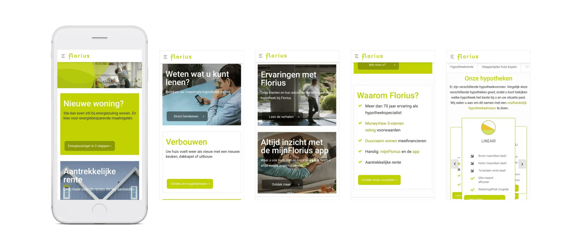
Mortgage specialist Florius has provided more than 400,000 customers with a mortgage over 70+ years. Florius wanted to introduce a new house style, and therefore wrote a pitch. Conclusion Experience won the pitch with flying colours. What did we need to do? The website had to be responsive, offer a better user experience, and the service provision needed some attention paying to it.
From design workshops to a stimulating website
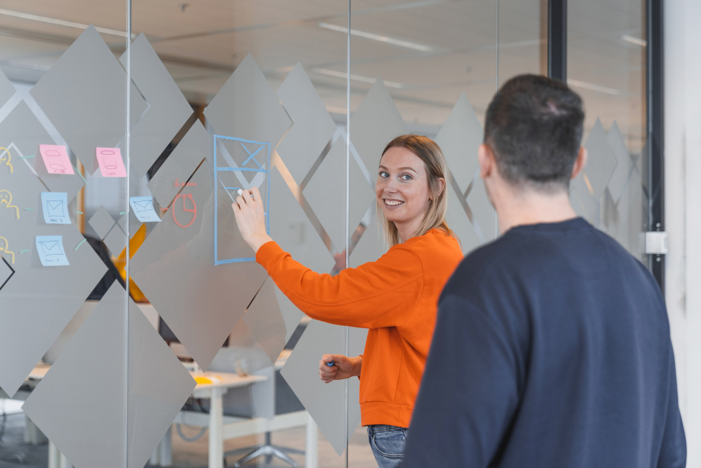
Before we could get started with the website, we followed Florius design workshops. With these insights we were able to develop the necessary functionalities for their customers. We built the website from a modular structure in Sitecore, which meant the editors were not limited by a static design. We also contributed to content creation, such as the design of campaign banners. The new website offers many advantages:
- The appearance of the website has been greatly improved and is a better fit with the Florius brand.
- The website is more user-friendly: all the information is displayed clearly.
- The design is recognisable and simple, making the mortgages more understandable.
- The unique banner attracts attention and gives the website a high-quality look.
- The modular structure ensures Florius can personalise the website itself.

Easy to use and a fresh look
"Based on the insights we got from the workshops, we worked out the functionalities that new and existing Florius customers considered necessary. The result is a professional and user-friendly corporate website."
Julien Mohr, Strategic Design Director at 4Net (Part of Conclusion Experience)


